Theming the Embedded UI
A guide to providing Wayflyer with the necessary style elements to make the embedded UI look and feel like a native part of your platform.
A guide to providing Wayflyer with the necessary style elements to make the embedded UI look and feel like a native part of your platform.
Using the UI SDK allows you to embed Wayflyer's UI directly into your application, significantly reducing development and design work. As part of onboarding, you will provide us with your brand style elements, and we will apply them to the CTA banner and the Embedded Journey panel to ensure they match the look and feel of your platform.
This guide provides a list and examples of the styles you will need to share with us for a seamless integration. After you provide your brand's style elements, we will create your theme which will be visible when you implement the SDK.
Please note: If you do not provide any of the required style elements, we will use our default styling.
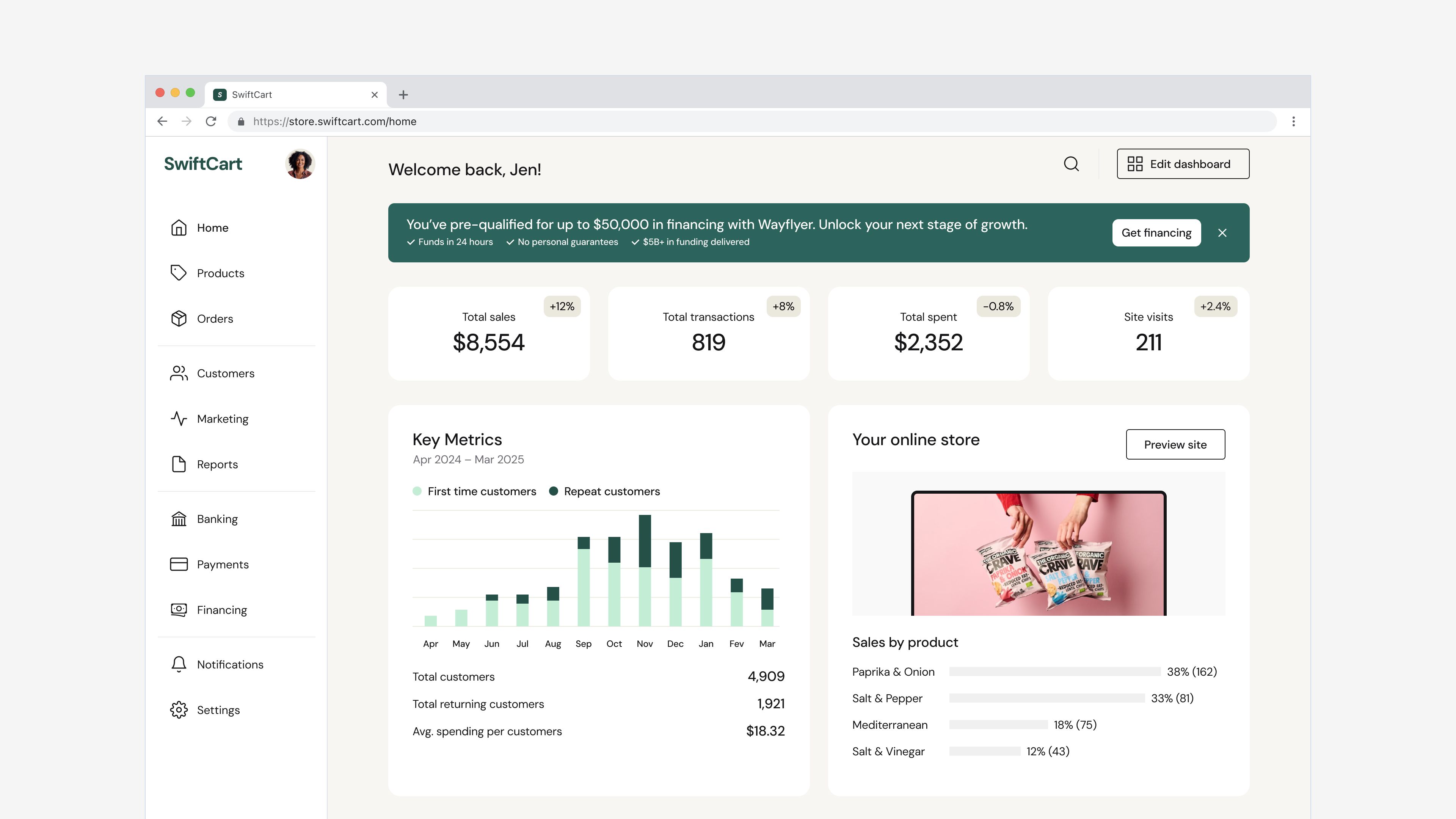
The CTA banner displays Wayflyer's indicative offer or other relevant calls-to-action. The banner will show different content depending on the availability of the indicative offer and the status of the user's application.
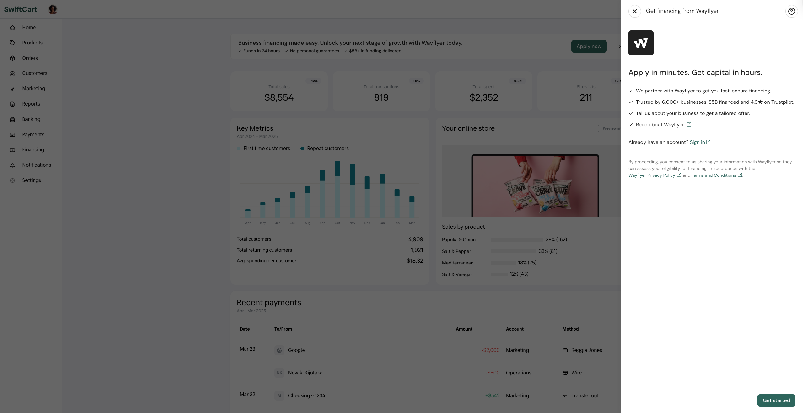
The Embedded Journey panel opens when a user clicks the CTA banner. It guides the user through the application process step by step, collecting contact details, company information, and business details — all within your platform — before handing the user over to Wayflyer to finalise.
For a seamless user experience, we customise the UI components to align with your brand. To enable us to do this, we need the following from you:
After reviewing this guide, provide the following to your Partnerships Manager or the Wayflyer Product Manager via email or Slack.
Provide the exact font name used on the site where the SDK will be embedded, as specified in the CSS font-family property.
Wayflyer will use this colour to highlight main actions such as primary buttons and interactive states. This colour is applied across the CTA banner and the Embedded Journey panel.
Please provide the colour in hex format (e.g. #FF5733).
Provide your brand's logo as an SVG file with the following requirements:
The logo is displayed within the Embedded Journey panel to reinforce your brand throughout the application experience.
There are two options for the CTA banner which allow you to customise its prominence on your platform:
For the best results, the CTA banner should be placed at the top of the screen, before any other content. It should span the full width of the content area to ensure text displays correctly. If this is not possible, it can be placed after the most important element on the page, but should still be visible above the fold to ensure higher conversion rates.