Theming the Embedded UI
A guide to providing Wayflyer with the necessary style elements to make the embedded UI look and feel like a native part of your platform.
A guide to providing Wayflyer with the necessary style elements to make the embedded UI look and feel like a native part of your platform.
Using our UI SDK allows you to embed Wayflyer's UI directly into your application, which significantly reduces your development and design work. As part of your onboarding, you'll provide us with your brand style elements, and we will apply them to the Wayflyer banner and modal to ensure they match the look and feel of your platform.
This guide provides a list and examples of the styles you'll need to share with us for a seamless integration. After you provide us with your brand's style elements, we will create your theme which will be visible when you implement the SDK.
Please note: If you do not provide us with any of the required style elements, we will use our default styling.
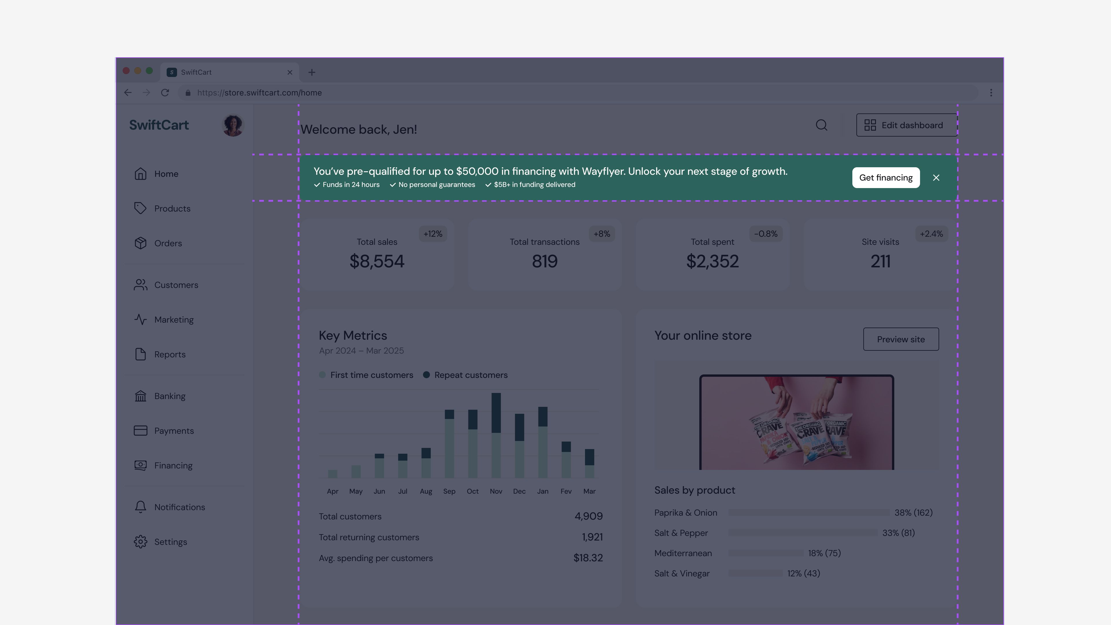
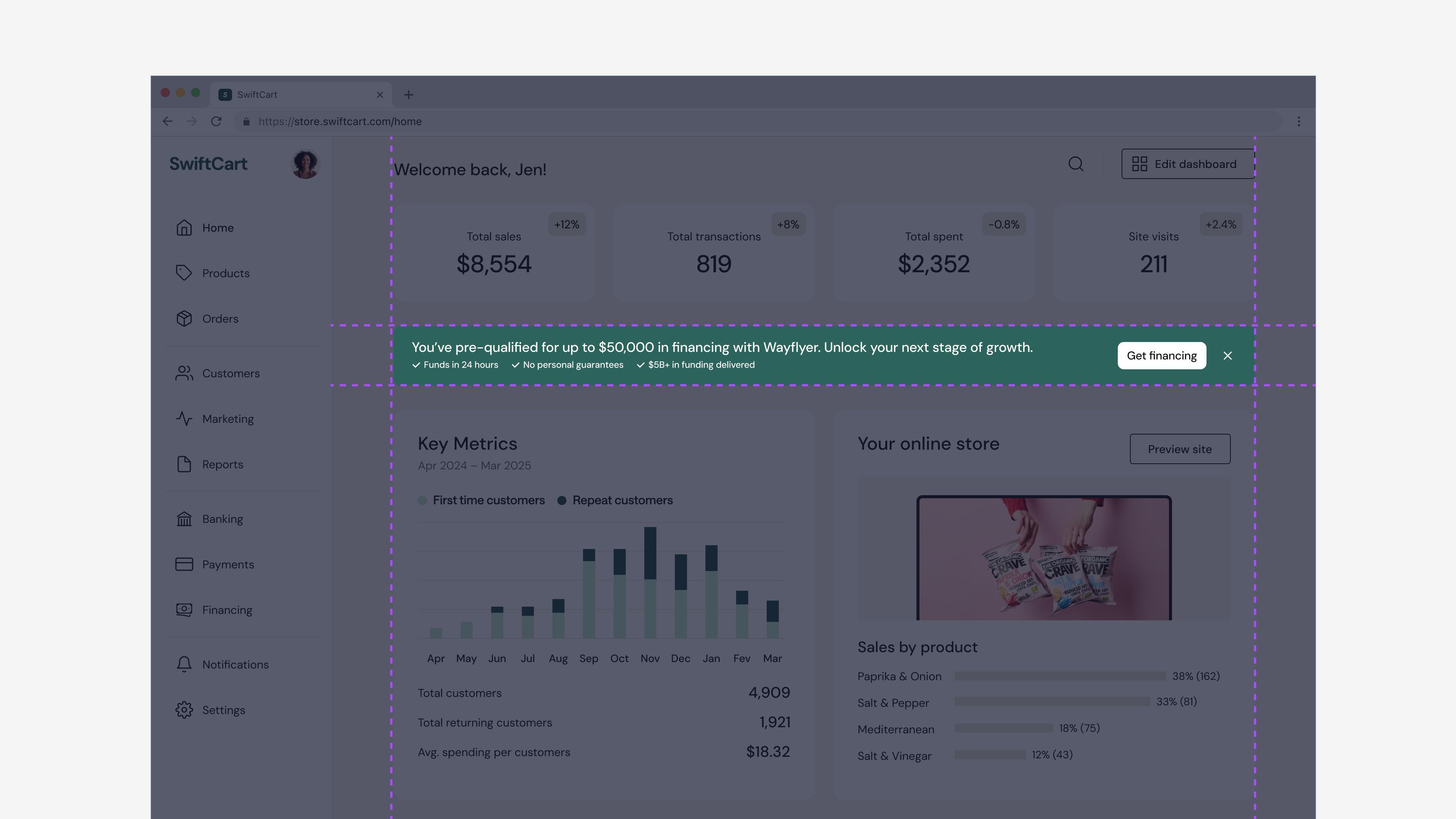
The Financing banner displays Wayflyer's indicative offer or other relevant calls-to-action. The banner will show different content depending on the availability of the indicative offer and the status of the user's application.
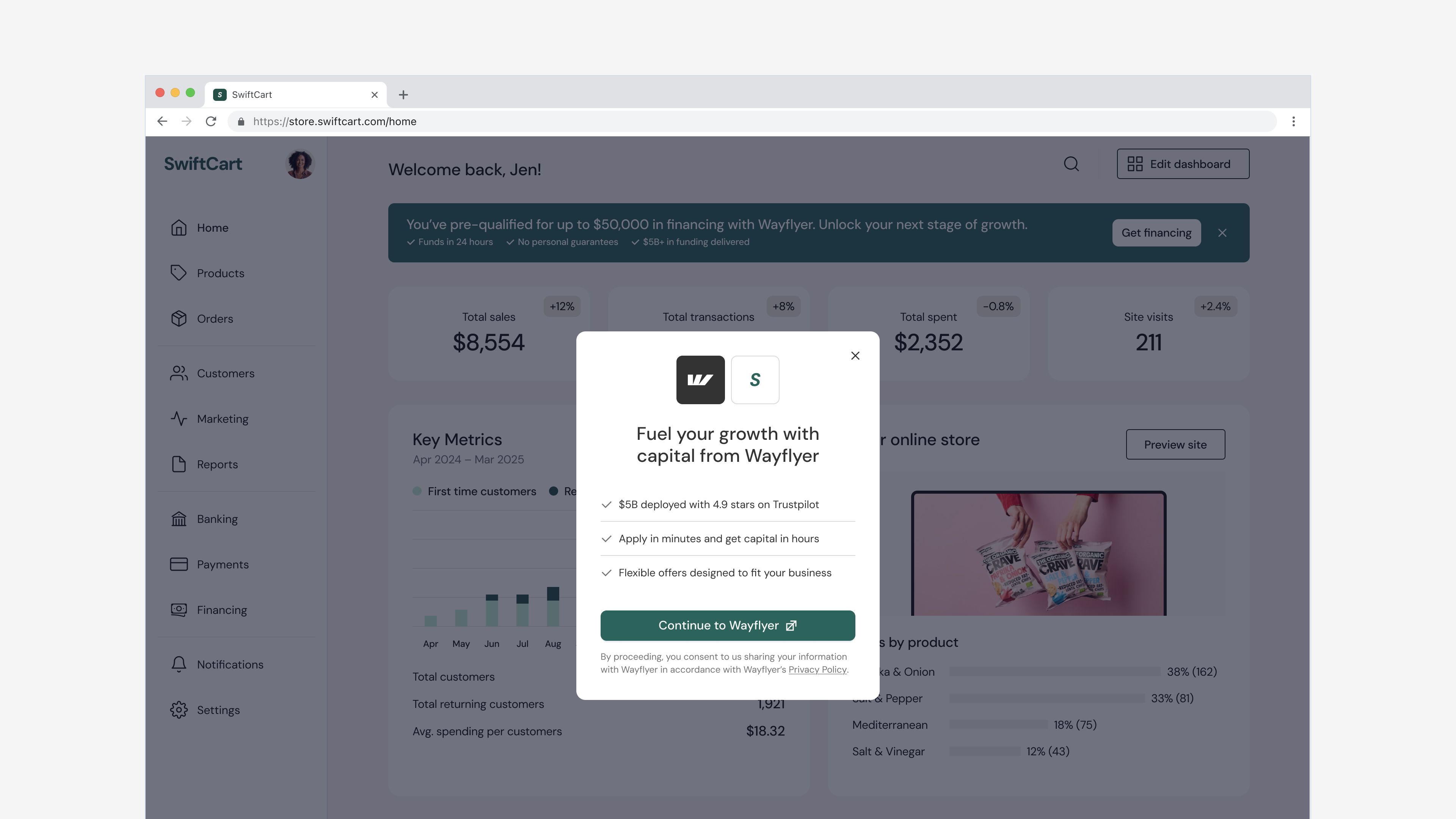
The Consent modal appears after a user clicks 'Get financing.' It provides more context about Wayflyer, and asks the user to consent to sharing information so they can proceed with their application.
For a more seamless user experience, we customize the user interface and Embedded components to align to your brand style requirements. To enable us to customize the UI, we need the following from you:
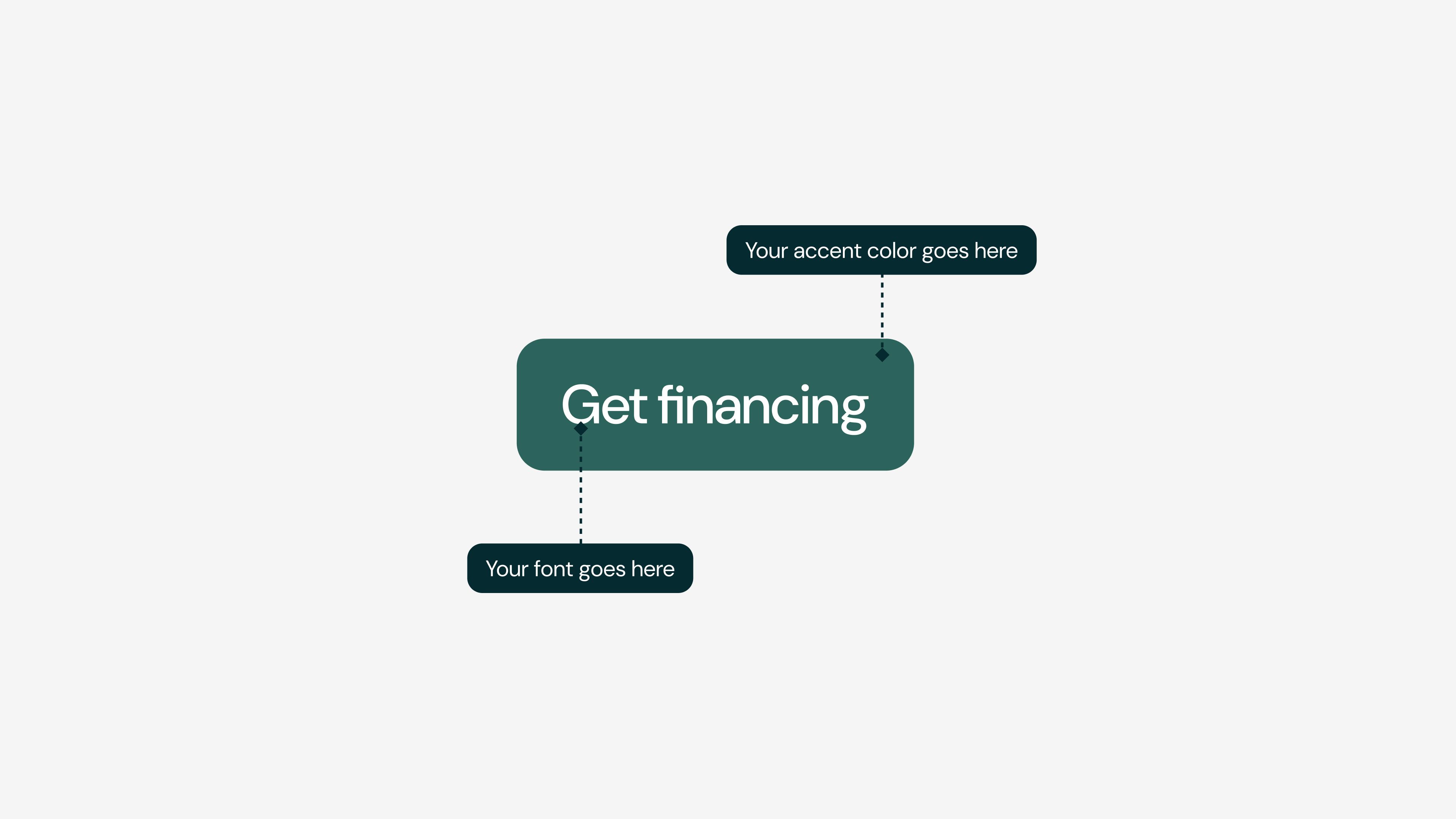
Provide the exact font name used on the site to be embedded, as specified in the CSS font-family property.
Wayflyer will use this color to highlight main actions such as primary buttons, interactive states, etc. The screenshot below demonstrates how the font and accent color will be used on a primary button.
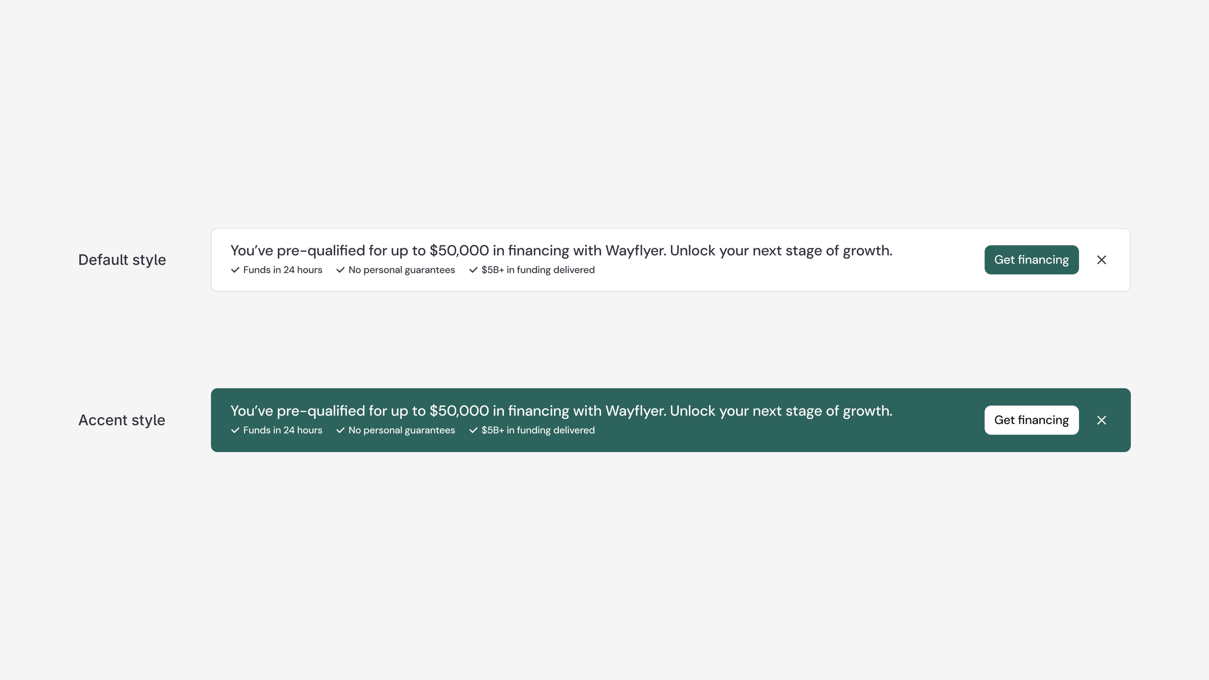
There are two options for the 'financing banner' which allow you to customize the prominence of your Financing banner component to make it stand out more or less on your platform. Choose either the Default style or the Accent style options (see screenshot below).
For the best results, the Financing banner should be placed at the top of the screen, before any other content. It should span the full width of the content area to ensure text displays correctly. If this isn't possible, it can be placed after the most important element on the page, but should still be visible above the fold to ensure higher conversion rates.